Digital Accessibility – Creating a Workplace for Everyone
08/09/2021

The topic of accessibility commands more and more attention in design and development of IT projects – one factor being the regulatory obligation of the public sector to design IT and communication technologies as accessible in accordance with the German BITV 2.0 (Accessibility of IT Act). But what exactly does digital accessibility mean?
Accessibility in the classical sense means that buildings and public spaces, transportation and objects of daily use, workplaces and apartments, services and leisure facilities are designed in such a way that all people can access them without help from third parties. When talking about the digital world, this basically means the same thing: Free access to the internet and other digital applications for all.
But how should this work? Everything that is digital is audio-visual, isn’t it?
And herein lies the challenge. How do you design an audio-visual medium in such a way that, for example, people with visual or hearing impairments can access it as well as other people?
TYPES OF IMPAIRMENTS
Different kinds of disabilities have different effects on the handling and perception of digital sites and content. We distinguish between visual, motoric, acoustic and cognitive impairments:
Visual impairments
- Blindness
- Impaired vision
- Color vision deficiency
For blind people, there are tools to “hear” websites. They use speakers and so-called screen readers, i.e. software that converts digital text into language or a tactile writing system (braille). The output device for this is called a refreshable braille display. These supporting technologies are also known as assistive technologies (AT). Well-known screen readers are VoiceOver for iOS, macOS, JAWS, or NVDA for Windows. They also offer a wide range of hotkeys to navigate directly to paragraphs, headlines or links, or to move within tables.
 Screen readers are not only used by fully blind people; people with impaired vision use these tools in connection with a screen magnifier (an app that can magnify parts of the screen), and they are also useful to people with reading disabilities or people who find it easier to understand spoken text. Colorblind people cannot see colors, only contrasts, i.e. dark and light; people with a color vision deficiency see certain colors “differently”. Color vision deficiency occurs more often in men than women and it can manifest in many different ways: Impairments in seeing reds or greens, red blindness, etc.
TRANSLATING VISUALS INTO HAPTICS
To give blind users access to features and content using screen readers, all content must also be available as text or text equivalent (e.g. for images and graphics), and it must be possible to control it via keyboard. All controls, headings, tables, links etc. should be marked accordingly, allowing the screen reader to correctly interpret them and read them out loud. Videos containing information often need audio description in addition to the regular audio track, explaining what is going on in the video.
For users with visual impairments, certain contrast ratios must be observed. Links and buttons must have a visible focus. For example, it is necessary to see if the button is currently active, e.g. by using a visible border. The hover focus must also be clearly visible. In general, all important information should be shown as text. Text within graphics should be avoided.
Movement impairments
- Slow reaction time
- Impaired fine motor skills
People with movement impairments can also find it quite difficult to use a computer. About 1.2 million people in Europe suffer from Parkinson’s disease. For them, it is extremely difficult to operate a mouse. The same is true for people with spinal injuries, paralysis, lost extremities, muscle diseases or arthritis. They can use supporting tools like eye tracking, voice recognition software, mouth or head styluses, and specially optimized keyboards or push button input devices.
MOUSE ALTERNATIVES
Browser and OS user interfaces must be completely controllable via the keyboard. Clickable elements must be a certain size and appearance so that they can be enabled and recognized as such. Moving buttons and links that wander around the screen are to be avoided completely. Longs lists and large volumes of content should be structured and marked so that they can be skipped. Users must be informed in time of a session ending and offered the option to prolong the session. Actions that conclude a contract or place an order have to be marked as such, and if initiated by mistake, it must be possible to undo the action.
Acoustic impairments
- Deafness
- Impaired hearing
Obviously, for people without hearing, audio is not helpful. They need all information in visual form, i.e. as text or video. Deafblind people usually access content on the web with a braille display that automatically refreshes its output. Special keyboards with a built-in braille display have been developed for this purpose.
Obviously, for people without hearing, audio is not helpful. They need all information in visual form, i.e. as text or video. Deafblind people usually access content on the web with a braille display that automatically refreshes its output. Special keyboards with a built-in braille display have been developed for this purpose.
VISUALIZING SOUNDS
Audio recordings can be transcribed. The transcription text contains the same information as the audio file. If it is necessary to distinguish between different voices, speakers should be marked accordingly. Relevant sounds like music or applause must also be recorded in written form. Videos with an audio track must have closed captions shown in-sync with what is happening in the video.
Cognitive impairments
- Learning disabilities
- Distractibility
- Concentration deficits
Mental impairments are the most common disability. Take, for example, Alzheimer’s: In Germany, about 1.6 million people are affected by the disease. Cognitive impairments can be congenital or occur during a child’s development, or they can be caused by accidents, infections or by chemical contamination and other environmental causes. They manifest by limited understanding, low tolerance for excessive cognitive demands or limited problem-solving capabilities. Other types of cognitive impairments can include short-term memory loss, concentration deficit disorders and reading disability or math learning disorders. Blinking or flashing effects can trigger seizures, an impairment known as photosensitive epilepsy.
Simple, comprehensible user guidance
For all people with diminished understanding, the design of user interfaces, navigation and content should be as simple as possible. Sometimes, help features can assist with complicated actions or content. Options should be well structured and limited. Video and audio players should be limited to relevant content and as short as possible.
For users with short-term memory loss, it is helpful to have paths that show the current step, e.g. when ordering something. Information should always be saved when the user moves to another screen.
People with attention deficit disorders can be easily disturbed by distracting elements. Here, it is helpful to reduce elements such as ads, carousels and flashy video or audio content to a minimum.
To make your content easier to grasp for people with reading disabilities, add illustrations, videos or audio to text.
Statistics and target groups
Disabilities in Germany in 2018 (German Federal Statistical Office)
► 7.8 million severely disabled people
► 240,000 people with visual impairments, of whom 70,000 are blind
► 4 million illiterate
► 10% with reading and/or writing disability
► 80,000 deaf people
► 190,000 people with hearing impairments, balance or language disorders
► 575,000 with limited use of arms and/or legs
► 500,000 epileptics in therapy
► 750,000 people with concentration deficit disorders
► 7.5 million people with functional illiteracy
There are about 80 million people with a disability in the EU, which represents about 15% of the European population.
Accessibility features help all
It is not only the people with vision, movement, hearing, or cognitive impairments that profit from accessible web design: Other groups, like senior citizens, non-native speakers, migrants, tourists and inexperienced users, also welcome clear, easily comprehensible UI design. Even search engines reward accessible design with better placement among search results.
Laws, regulations and directives
The aim of the Directive (EU) 2016/2102 of the European Parliament and of the Council of 26 October 2016 is to ensure that public sector bodies’ websites and mobile apps are made more accessible on the basis of common accessibility requirements. The directive points to the European standard EN 301 549 (Accessibility requirements suitable for public procurement of ICT products and services in Europe), which amongst other things contains the requirement to meet WCAG 2.1 Level AA (Web Content Accessibility Guidelines).
This directive is translated into German law with the BGG Act (Equality for People with Disabilities Act) and the BITV 2.0 (Accessibility of IT Act). Content must not only fulfil WCAG and EN 301 549 Annex A, but it must also contain an accessibility declaration, a feedback mechanism and important content in sign language and Plain German.
TESTING PROCEDURES
FOR CHECKING ACCESSIBILITY
BITV test
The so-called BITV test (www.bitvtest.de, in German) provides a reputable renowned test methodology for complete and reliable testing of website and web application accessibility. The test was designed under the German BIK project, which aims to support accessible information sharing and communication. The project was supported by the German Federal Ministry of Labor and Social Affairs. The test is used and further developed by test labs in the BITV Test Prüfverbund Association.
This test methodology contains 92 test steps that also cover the requirements of WCAG 2.1 Level AA and the relevant criteria of the EN 301 549 Annex A. When a test lab receives a test order, the first step is to select webpages or screens to ensure as high a test coverage as possible.
For example, all major web technologies in use should be tested for accessibility. The test report contains the test results divided into individual test steps, as well as hands-on tips to address the problem. Here you can also do a free self-test which will give you an idea about the accessibility of your own application or website.
There are several tools that are helpful for the testing process: the so-called Bookmarklets can be saved as bookmarks in the browser (http://pauljadam. com/bookmarklets) and highlight e.g. headline structures or table elements directly on the website that is being tested. The WCAG Color Contrast Checker allows you to highlight contrasts that are too low; and the ARC Toolkit Chrome Plugin combines several accessibility checks in one tool. Even with all these tools, most test steps require manual testing and expertise in order to identify barriers and to devise hands-on solutions for designers and developers.
BIT inklusiv BITV Software Test
The BIT inklusiv BITV Software Test can be used to check digital accessibility of application software developed for a workplace environment. The BIT inklusiv Netzwerk network includes test labs that offer accessibility consultations and tests. The test of BITV compliance is based on the requirements of the EU standard EN 301 549 Chapter 11. The test contains 75 test steps under the categories of Visibility, Usability, Understandability, Robustness, Assistive Technology Interoperability, Documented Use, User Preferences, Author Tools, Documentation and Supporting Services.
The test steps included in this test are public and can be found at www.bit-inklusiv.de (in German).
EXAMPLES FOR ACCESSIBLE WEBSITE DESIGN
Graphic controls (buttons, clickable logos, banners etc.) must be accompanied by alternative text in order to be accessible to screen reader users.
<img src=“images/logo. png“ height=“80px“ width=“260px“ class=“img- fluid nav-logo-desktop“ alt=“Company Logo Test
Services and Web Solutions“>
Icon fonts that do not contain information should be hidden from screen readers using aria- hidden=“true“, otherwise the screen reader might read them as special characters. Alternative text can be assigned using aria-label:
<button aria-label=“Menu“>
<i class=“fa hamburger menu“
aria-hidden=”true”></i>
</button>
The show/hide state of menus and accordion elements should be marked with aria-expanded: aria-expanded=“true“ for the expanded state and aria-expanded=“false“ for the hidden state.
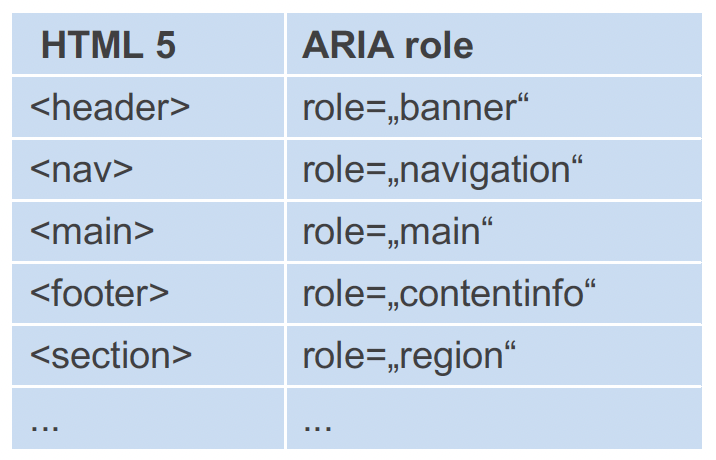
To make certain parts of a website or web application accessible for assistive technologies, these parts must be labeled accordingly, using HTML or an ARIA role.

ARIA describes a method to make web content and web applications more accessible to people with disabilities. It gives developers a tool to define names, roles, states, and properties of HTML elements. ARIA should only be used when no alternative realization in HTML is possible – as much HTML as possible, as much ARIA as necessary!
Colorblind users need high-contrast visuals; for content text, text-based buttons, etc. in font sizes under 24 px (or 18.7 px, if bold) a contrast ratio of 4.5:1 or more, and for larger font sizes (>=24 px) a contrast ratio of 3:1 or more. For graphics and graphic controls, the contrast ratio of 3:1 to the neighboring colors should suffice. Exemptions are made for graphics where the colors cannot be changed – e.g. logos or flags.
Web editors
It’s not enough that designers and developers implement accessibility features: Web editors must also ensure that their content is accessible. Therefore, it is important to provide them with training. Especially when it comes to content management, it is important that images include alternative text, and that lists and headings are not only marked visually.
What lies ahead
As the public sector is required by law to design its digital content to be accessible, its bodies pay more attention to meeting the requirements of BITV. Therefore, more and more software developers and web agencies run into accessibility tasks. In addition, there is the new EU directive 2019/882 within the European Accessibility Act, which is to be implemented into national law by June 2022. It describes the accessibility requirements for products and services. This means that parts of the eCommerce sector will have to incorporate accessibility features soon. By this point, at the latest, digital accessibility will be a concern for everyone.
The Author: Sascha Noack
 SASCHA NOACK is the CEO of TWIN CUBES GmbH, headquartered in Illingen near Stuttgart, Germany. Sascha has been working as an IT consultant for more than 15 years. In consulting, he focuses on test management and test process improvement for complex IT projects. He also has a wide range of knowledge in accessible web development, holds workshops and writes expert opinions on accessibility.
COOPERATION BETWEEN MyQ AND TWIN CUBES GmbH
As MyQ’s primary mission is to deliver a personalized solution that is intuitive for its users, therefore, MyQ has decided to optimize its web UI in MyQ X version 8.2 to follow the above-mentioned guidelines and, in close collaboration with Twin Cubes GmBH, adjusted the virtual interface to hit all accessibility check marks.
Twin Cubes GmbH assisted MyQ web UI developers to meet all the requirements of the accessibility certification and helped them test the new product. The accessibility journey took more than 50 hours of consultations, preliminary reports and final tests, along with hundreds of hours of development since July 2020 until March 2021. The latest Accessibility patch was released on 1 April 2021 as part of a completely new software version MyQ X 8.2, which was also certified.
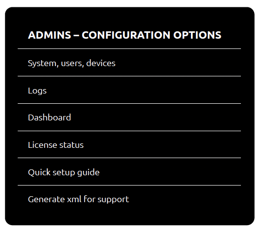
Now, the accessible MyQ X web UI helps users with disabilities to manage their printing tasks and enables MyQ X system administrators utilize advanced admin options.
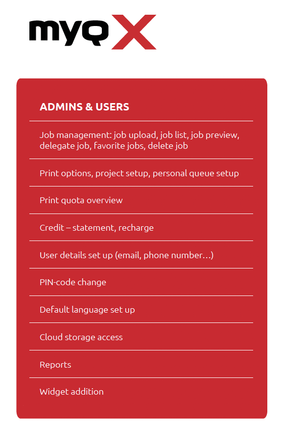
Features available to admins and users in MyQ X 8.2’s web UI:


All users ought to have the possibility to use state-of-art tools to help them with their daily tasks. MyQ has thus extended an accessible experience also to the mobile application MyQ X Mobile Client, which can handle all printing tasks from users phone.
As part of the development of MyQ X 8.2, MyQ’s web interface for both users and IT admins was significantly improved to meet the complex standards of Web Content Accessibility guidelines.
MyQ X
4 min read

